15 Beginner Canva Mistakes That Are Killing Your Designs (And How to Fix Them)
Canva has revolutionized the way we approach graphic design. It has empowered small business owners, students, and social media managers to create stunning visuals without needing a degree in fine arts. However, because the platform is so accessible, it is easy to fall into “rookie traps” that make your designs look cluttered, unprofessional, or just plain “off.”
If you’ve ever felt that your designs don’t quite look as polished as the templates you started with, you aren’t alone. Design is a skill, and even with the best tools, there are fundamental rules to follow.
In this guide, we will break down the 15 most common beginner Canva mistakes and—more importantly—provide you with actionable solutions to fix them today.
1. Overloading Your Design with Elements
One of the biggest mistakes beginners make is “blank space anxiety.” They feel every inch of the canvas needs to be filled with a sticker, a shape, or a text box. This leads to a cluttered design that confuses the viewer.
- The Fix: Embrace White Space (negative space). Allow your elements room to breathe. White space helps direct the eye to the most important part of your design, such as your call to action or your headline.
2. Using Too Many Different Fonts
It is tempting to use five different beautiful fonts in one graphic, but this is a quick way to make your work look amateur. Mixing too many styles creates visual “noise” and makes the text difficult to read.
- The Fix: Stick to a Two-Font Rule. Choose one bold font for your headings and a simple, clean sans-serif font for your body text. If you must use a third, make sure it is for a very specific accent.
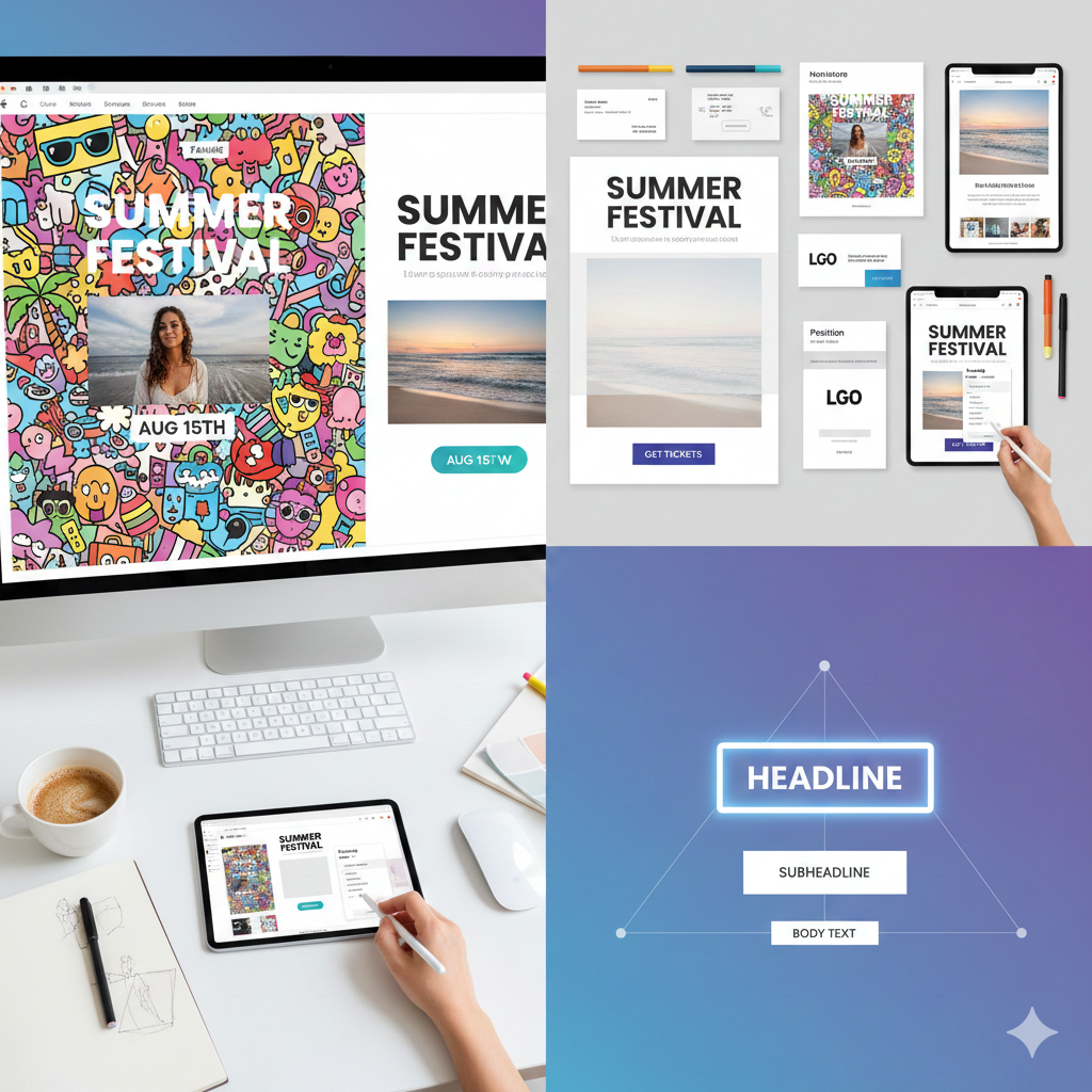
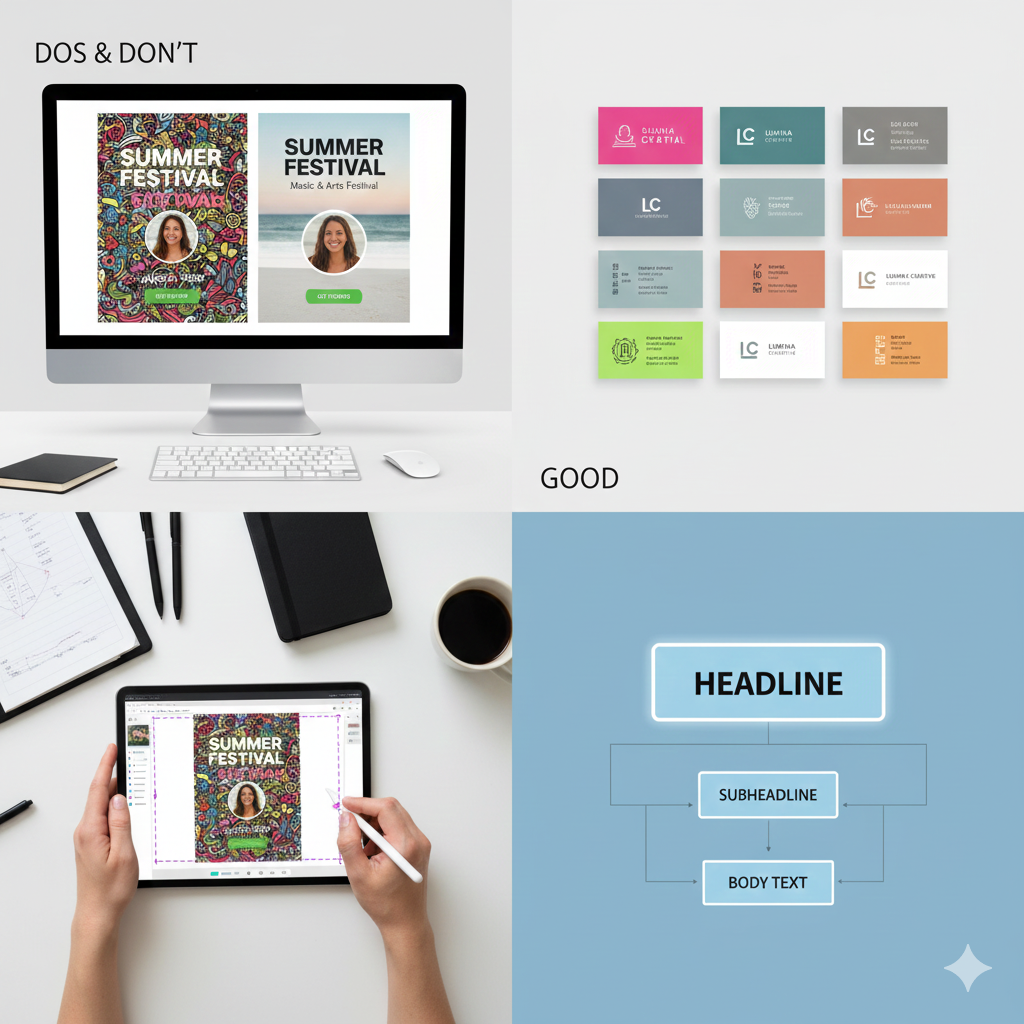
3. Ignoring Visual Hierarchy
Visual hierarchy is the arrangement of elements in a way that implies importance. Beginners often make the date of an event the same size as the title, or the logo larger than the main message.
- The Fix: Use size, color, and weight to guide the reader. Your Headline should be the largest, followed by the Subheadline, and then the Body Text.
4. Poor Color Contrast
Have you ever seen light yellow text on a white background? It’s nearly impossible to read. Poor contrast is a major accessibility issue and a design killer.
- The Fix: Ensure there is a high contrast between your background and your text. Use dark text on light backgrounds and light text on dark backgrounds. If you are unsure, Canva has built-in accessibility tools to check if your colors are readable.
5. Stretching or Distorting Images
When resizing a photo, some beginners pull from the sides rather than the corners. This results in “squished” or “stretched” images where people look wider or taller than they actually are.
- The Fix: Always resize images by dragging from the corner handles. This maintains the aspect ratio. If you need to fit an image into a specific shape, use Canva’s “Frames” feature instead of forcing the image dimensions.
6. Overusing Stock Elements and Stickers
While Canva’s library is massive, using the most popular “cartoonish” stickers can make your brand look cheap. If your design looks exactly like a thousand others, you lose your unique identity.
- The Fix: Be selective. Use high-quality photography and subtle graphic elements. Try to customize the colors of the elements you pick to match your specific brand palette.
7. Bad Alignment and Spacing
Elements that are “almost” centered but slightly off are incredibly distracting. Beginners often “eyeball” the placement of text and icons, leading to an unbalanced layout.
- The Fix: Use the Position tool. Select your elements and use the “Tidy Up” feature or “Center” alignment. Turn on “Show Rulers and Guides” in the File menu to ensure everything lines up perfectly.
8. Not Using “Group” and “Lock” Features
Have you ever spent twenty minutes perfecting a layout only to accidentally move the background while trying to click a button? This frustration leads to rushed, messy work.
- The Fix: Once you are happy with how two elements look together (like an icon and its label), Group them (Ctrl+G). If your background is set, Lock it so it stays put while you work on the foreground.
9. Forgetting About Bleed and Margins (For Print)
If you are designing a business card or a flyer to be printed, you cannot design right up to the very edge. Most printers cut off a few millimeters, which could ruin your design.
- The Fix: Go to File > View Settings > Show Print Bleed. Keep all your important text and logos inside the “Safe Zone” (the inner margin) to ensure nothing gets cut off during the printing process.
10. Using Low-Resolution Images
Taking a small thumbnail image from the web and blowing it up to fit a poster will result in a blurry, pixelated mess.
- The Fix: Use high-resolution images. If you are uploading your own photos, ensure they are at least 300 DPI (dots per inch) for print. In Canva, look for the “Pro” or high-quality free icons that are vector-based, as they never lose quality.
11. Inconsistent Branding
If your Instagram feed has a different color scheme and font style in every post, you are failing to build brand recognition.
- The Fix: Set up a Brand Kit in Canva. Save your specific hex codes (e.g., #FF5733) and your primary fonts. Use these consistently across every single design so your audience recognizes your work instantly.
12. Using Hard-to-Read Script Fonts
Cursive and script fonts are beautiful, but they are often difficult to read, especially on mobile devices. Beginners often use them for long sentences or important information.
- The Fix: Only use script fonts for short accents (1–3 words). Never use them for your main body text or for critical information like phone numbers or dates.
13. Neglecting Letter Spacing and Line Height
Sometimes text feels “cramped,” making it hard for the eye to scan. Default settings are not always the best settings for your specific font.
- The Fix: Use the Spacing tool. Increasing the “Line Spacing” (Leading) slightly can make a paragraph much more readable. Adjusting “Letter Spacing” (Kerning) can give a luxury, modern feel to your titles.
14. Over-complicating the Background
A busy background with lots of patterns and colors makes it impossible to read the text on top of it.
- The Fix: If you have a busy photo background, add a Semi-transparent Overlay (a colored square with reduced opacity) between the photo and the text. This “muffles” the background and lets the text pop.
15. Lack of a Clear Call to Action (CTA)
You’ve made a beautiful design, but the viewer doesn’t know what to do next. Is it for a sale? A webinar? A sign-up?
- The Fix: Every design should have a purpose. Make your CTA button or text stand out. Use a contrasting color and clear language like “Register Now” or “Shop the Sale.”
Summary Table: Quick Fix Guide
| Mistake | The Solution |
| Clutter | Use more white space. |
| Font Overload | Stick to 2–3 fonts maximum. |
| Blurry Images | Check resolution and use Canva Frames. |
| Poor Contrast | Use dark text on light backgrounds (and vice versa). |
| Misalignment | Use the “Position” and “Tidy Up” tools. |
Conclusion: Practice Makes Perfect
Mastering Canva doesn’t happen overnight, but by avoiding these 15 common pitfalls, you are already ahead of 90% of beginners. Design is about communication, not just decoration. When you prioritize readability, consistency, and simplicity, your designs will naturally look more professional and trustworthy.
The next time you start a project, take a moment to look at your margins, check your font count, and ensure your message is clear. With these “fixes” in your toolkit, you’ll be creating high-converting, beautiful graphics in no time.
Frequently Asked Questions (FAQ)
1. Is Canva Pro worth it for beginners?
While the free version is powerful, Canva Pro offers features like the Background Remover, Brand Kit, and a much larger library of premium elements that can save you hours of work. If you are using Canva for business, it is generally a worthwhile investment.
2. How do I choose the right colors for my design?
If you’re not sure where to start, use the Canva Color Palette Generator. You can also search for “Color Palettes” in the Canva templates tab to see combinations that designers have already vetted for harmony.
3. Can I use Canva designs for commercial purposes?
Yes, you can use Canva to create marketing materials, social media posts, and even products for sale. However, you cannot sell standalone Canva elements or templates as your own work. Always review Canva’s Licensing Agreement for the most current rules.
4. Why does my design look different when I print it?
Computers use RGB (light-based color), while printers use CMYK (ink-based color). Some colors that look bright on screen may appear duller in print. When downloading for print, select “PDF Print” and check the “CMYK” option (available in Pro).
5. What is the best font for readability?
For digital screens, “Sans Serif” fonts like Montserrat, Open Sans, or Roboto are generally the easiest to read. Avoid using highly decorative or thin fonts for body text.
6. How can I make my text stand out on a photo?
Try adding a “Lift” effect to your text (under the Effects menu), or place a slightly transparent shape behind the text to create a “container” that separates it from the background.