How to Create a Branded Social Media Kit in Canva
In the digital world, your brand is more than just a logo; it is the “digital handshake” you offer to your audience. For bloggers and coaches, consistency is the difference between being a “random account” and a “trusted authority.” When a follower moves from your Instagram to your blog, the transition should feel seamless. If your colors, fonts, and imagery change constantly, you risk losing that hard-earned trust.
This is where a Social Media Brand Kit comes in. A brand kit is a curated collection of visual assets that ensures every piece of content you post looks like it belongs to you. Using Canva, creating this kit is no longer a task reserved for high-priced design agencies.
In this guide, we will walk you through the step-by-step process of building a professional social media kit that reflects your unique voice and captivates your audience.
1. Defining Your Brand Identity: The Foundation
Before you pick a color or a font, you need to understand the “vibe” of your brand. A health coach for busy executives will have a very different visual language than a travel blogger for Gen Z.
Ask Yourself the “Three Words” Question
If your brand were a person, how would you describe it?
- Professional, authoritative, and clean? (Think: Navy blue, sans-serif fonts, sharp lines).
- Warm, nurturing, and organic? (Think: Earth tones, soft scripts, hand-drawn elements).
- Bold, energetic, and modern? (Think: Neon accents, heavy typography, high contrast).
Pro Tip: Create a “Mood Board” in Canva. Search for photos and elements that resonate with these three words and place them on a single page. This will act as your visual compass.
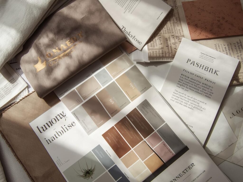
2. Selecting Your Brand Color Palette
Colors evoke emotions. Choosing the right palette is vital for the psychological impact your brand has on potential clients or readers.
The 60-30-10 Rule
A balanced brand kit usually follows this distribution:
- 60% Primary Color: Usually a neutral (white, off-white, light grey, or navy) for backgrounds.
- 30% Secondary Color: Your main “brand” color that defines your look.
- 10% Accent Color: A “pop” color used for Call-to-Action buttons or highlights.
How to Fix It in Canva:
Use the Canva Color Palette Generator. You can upload a photo you love, and Canva will extract the hex codes for you. Ensure you save these codes (e.g., #FF5733) because you will use them in every single design.
3. Choosing Your Typography Pairing
Typography speaks volumes before the reader even finishes the sentence. For bloggers and coaches, readability is the highest priority.
- Heading Font: This can be a bit more unique. It’s your “personality” font.
- Body Font: This must be a clean, simple font (like Montserrat, Open Sans, or Lato). Avoid using scripts or decorative fonts for long paragraphs, as they cause eye strain on mobile devices.
Expert Insight: Limit your kit to two fonts. Using more than two creates visual clutter and makes your designs look amateur.
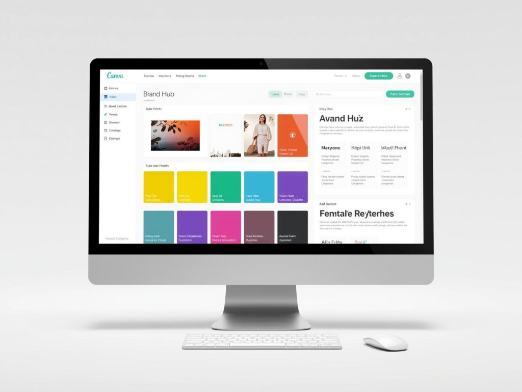
4. Setting Up the Canva Brand Kit Tool
If you have Canva Pro, the Brand Kit feature is your best friend. Even with the free version, you can manually keep these elements organized.
Step-by-Step Setup:
- Logos: Upload your main logo, a sub-mark (a smaller version), and your favicon.
- Colors: Input your hex codes so they appear at the top of your color picker every time you design.
- Fonts: Set your default styles for Headings, Sub-headings, and Body text.
By doing this, you eliminate the “guessing game” and ensure that a post created today matches a post created six months from now.
5. Designing Your Essential Social Media Templates
A brand kit isn’t complete until you have ready-to-use templates. This saves you hours of work every week. For bloggers and coaches, you should create the following:
Instagram Post & Story Templates
- The Quote Template: A clean background with your brand font.
- The Educational Carousel: 5–7 pages that break down a complex topic.
- The “New Blog Post” Graphic: A template with a placeholder for your latest photo.
Pinterest Pins
Pinterest is a visual search engine. Your pins should be vertical (1000 x 1500 px) and feature large, readable text overlays. Coaches should focus on “How-to” headlines that promise a solution.
Facebook/LinkedIn Cover
Your cover photo is your “digital billboard.” It should clearly state what you do and who you help, using your brand colors and fonts.
6. Curating Your Brand’s Imagery Style
Whether you use stock photos or your own photography, there should be a consistent “look.”
- Filters: If you use a specific Canva filter (like “Solar” or “Festive”), apply it to all your photos at about 20% intensity to create a unified feel.
- Graphics & Icons: Decide if your brand uses 3D elements, minimalist line art, or hand-drawn doodles. Don’t mix styles, as it breaks the visual harmony.
7. Adding the “Professional Touch”: Consistency Checks

Before you consider your kit “finished,” run these three checks:
- Contrast Check: Is your text easy to read on your brand colors?
- Mobile Test: Open your design on your phone. Is the font large enough?
- The “Squint” Test: Squint at your design. If you can still tell what the most important part is (the Headline or CTA), your hierarchy is correct.
Conclusion: Empower Your Brand with Visual Clarity
Building a branded social media kit in Canva is an investment in your future growth. For bloggers and coaches, it removes the friction of content creation and allows you to focus on what you do best: sharing your message and helping your clients.
When your brand looks professional, you feel more confident. That confidence translates into better content, higher engagement, and ultimately, a more loyal audience.
FAQ: Branded Social Media Kits
1. Do I need Canva Pro to make a brand kit?
While Canva Pro allows you to save colors and fonts directly into the “Brand Hub” for one-click access, you can still create a brand kit on the Free version. You simply need to keep a “Brand Style Guide” document where you copy and paste your hex codes and font names manually.
2. How many colors should be in my brand kit?
Usually, 3 to 5 colors are plenty. This includes a light background color, a dark text color, and 1–2 accent colors for buttons or highlights.
3. Can I use Canva templates for my brand?
Yes, but you must customize them. Change the template’s default colors and fonts to your own. If you use a popular template without changes, your brand will look like everyone else’s.
4. What is a “Sub-mark” logo?
A sub-mark is a simplified version of your logo, often circular or icon-based. It is perfect for profile pictures or as a “watermark” on the corner of your social media posts.
5. Why is my logo blurry when I upload it to Canva?
Ensure you are uploading a high-resolution file. Ideally, use a PNG with a transparent background or an SVG (Scalable Vector Graphic) if you have Canva Pro. SVGs never lose quality no matter how much you resize them.
6. Is it okay to change my brand colors later?
Yes, brands evolve! However, try not to change them more than once a year. Constant rebranding confuses your audience and dilutes your brand recognition.